São Paulo's Cannabis Cultural Association
Brand Strategy and Visual Identity
Innovating in cannabis culture and community

Challenge
ACuCa SP — the Cannabis Cultural Association of São Paulo — faced the challenge of repositioning its brand to strengthen the dialogue about cannabis culture in Brazil, a topic surrounded by stigmas and misinformation.
The objective was to create an innovative visual identity that challenged the stereotypes associated with marijuana, consolidated ACuCa SP as a space for dialogue and information, and authentically and representatively reflected the values of the community.
How to create an identity that broke down prejudices, strengthened the sense of belonging, and engaged with the advocacy sector in a mature
and strategic way?
Strategy
A brand created by the community, for the community
The strategy was based on co-creation and participatory construction, placing the community at the center of the process of creating the new visual identity:
-
Positioning as a movement of belonging
The new identity should go beyond a graphic symbol — it needed to function as a symbol of resistance and unity, reflecting the collective spirit of ACuCa SP.
-
Democratic and participatory process
To ensure that the brand truly represented the community, an open call was proposed so that members and non-members could submit proposals.
The process was structured so that community involvement was not just symbolic, but rather a strategic element in the construction of the identity.
-
Strategic and representative tone of voice
The language should be direct and respectful, engaging clearly with different sectors — from militancy and activism to institutional and public policy spaces.
The idea
A brand that symbolizes resistance and belonging.
The creative proposal was to develop an identity that combined:
-
Visual simplicity – To facilitate recognition and application across different platforms.
-
Cannabis culture beyond stereotypes – Review of visual and graphic elements inspired by the aesthetics of the culture and social movements.
-
Community representativeness – An identity built from the experiences and values of the members.
The new identity became a symbol of belonging and resistance, reinforcing ACuCa SP's position as a space for information, dialogue, and advocacy for cannabis culture.
Process
From concept to visual identity
1 Definition of positioning and strategic briefing
Mapping core values and directions.
Before starting the creative development, I led a strategic immersion process to map ACuCa SP's core values and structure the creative briefing.
The process involved:
-
Mapping the brand's core values and attributes.
-
Defining persona and tone of voice.
-
Systematizing criteria for evaluating visual proposals (brand application, connection with values, and visual impact).
The strategic foundation was essential to ensure that the visual identity reflected the association's DNA and its political and social objectives.
2 Open call for the community
Collective construction as a form of belonging.
-
An open call was launched so that anyone, member or not, could submit proposals for ACuCa SP's new visual identity.
-
The call received 31 proposals, which were evaluated based on the strategic criteria defined in the briefing.
-
4 proposals were selected as finalists — the brand that best aligned with ACuCa SP's values and personality was revealed at a celebration event with the participation of community members.
The process not only strengthened ACuCa SP's bond with its base but also expanded the brand's reach and generated a sense of belonging among participants.
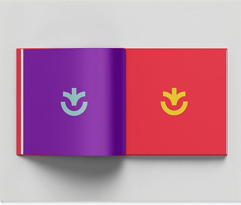
3 Development and implementation of the visual identity
From brand to practical application.
-
The winning brand was refined to ensure
its application was functional and consistent with ACuCa SP's different communication contexts and channels. -
The identity was translated into different formats:
- Logo and visual signature for social
media, events, and printed materials.
- Definition of color palette and graphic elements inspired by the aesthetics of cannabis culture.
- Creation of templates to guide the association's visual communication.
The new visual identity consolidated ACuCa SP
as a movement with its own voice, capable of engaging with different audiences clearly and strategically.
Legacy
✔️ New visual identity – The identity began to reflect ACuCa SP's
values and spirit, connecting authentically with the community
and the cannabis movement.
✔️Strengthening the bond with the community – The co-creation
process consolidated the sense of belonging and strengthened
the brand's legitimacy among its members.
✔️ Strategic positioning – The new identity positioned ACuCa SP
clearly and assertively within the national movement for the
legalization and recognition of cannabis culture.
✔️ Participatory construction model – The co-creation process
established a replicable model for other associations and
organizations in the sector.
Technical sheet
Client
Cannabis Cultural Association of São Paulo (ACuCa SP)
Working Group Leader
Angelo Piscitelli
Working Group
Keka Ritchie (Presidente Acuca), Dennis Koji, Gabriel Issler, Fernando Profeta e Tali Coelho
Branding Consulting and Asset Systematization
Gabi Neves
Design
Michel Martins