Bohemia Brewery
Naming & Tone of Voice
Going beyond the obvious to celebrate origins

Challenge
Bohemia Brewery, a pioneer in the production of craft beers in Brazil, faced the challenge of launching a new collection of three special labels that combined flavor, history, and innovation.
The objective was to create an authentic connection with Petrópolis, the city that is Bohemia's birthplace, without falling into clichés or obvious references to the imperial period — a territory already widely explored by the brand and other narratives in the region.
The challenge involved not only the development of naming and tone of voice but also the construction of a visual strategy for the product that translated Bohemia's values and positioning in a sophisticated yet accessible way.
How to transform the city's historical DNA into an innovative and contemporary narrative, capable of engaging new audiences and more experienced consumers?
Strategy
A new perspective on the city and its flavors
The strategy was to resignify Bohemia's relationship with Petrópolis, exploring less obvious but deeply rooted cultural and historical elements of the city's identity:
-
Reinforce the emotional bond with Petrópolis: The collection needed to capture the spirit and flavor of the city in a sensory and symbolic way.
-
Create accessible and inviting language: The collection's language should be simple and straightforward, capable of welcoming both new consumers and more experienced craft beer enthusiasts.
-
Translate brand attributes into visual and verbal symbols: The names and illustrations should create an immediate connection
with the flavors and essence of the city.
The tone of voice was developed to be direct, human, and approachable — without losing the touch of sophistication associated with the world of craft beers.

Process
From concept to label
1 Research and strategic definition
Mapping the sensory and cultural attributes of the brand
-
Mapping historical and cultural attributes of Petrópolis that could be transformed into symbolic elements for the collection.
-
Collecting references in landscapes, climate, traditions, and iconic figures of the city to create an authentic and sophisticated narrative territory.
-
Defining three central axes to guide creative development:
- Sensory elements – flavors, aromas, and textures associated with the geographical and cultural context of the city.
- Historical elements – symbolic connections with collective memory and local values.
- Emotional elements – the affective relationship between the brand, the city, and the consumer.
2 Naming and Tone of Voice
Creating a verbal identity connected to the territory and flavor
Based on the collected insights, the names and tone of voice for each label were developed, seeking to reinforce the connection with Petrópolis in a subtle and unusual way:
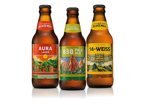
Aura Lager Inspired by the colors and beauty of the sunrise in Petrópolis.
838 Pale Ale A tribute to the altitude of Petrópolis (838 meters above sea level).
14 Weiss A reference to the 14 Bis airplane and the innovation of Santos Dumont, one of Petrópolis's illustrious visitors.
"
The tone of voice was developed to create a sensory and emotional experience, using simple, warm and welcoming, and accessible language.
3 Visual Identity Development
Translating flavor and narrative into aesthetics
-
The illustrations and visual elements were created to reflect the concept of each label and reinforce the bond with Petrópolis.
-
-
The labels were designed to stand out at the point of sale, using a balanced combination of colors, typography, and graphic elements.
-
The visual identity reinforced Bohemia's positioning as a brand of tradition and innovation, creating a sensory and symbolic connection with the public.
Legacy
✔️3 labels awarded by experts and the public.
✔️ Sales success – The collection quickly gained space at points of sale, expanding Bohemia's consumer base.
✔️ Strategic positioning reinforced – The collection consolidated Bohemia as a brand that authentically and sophisticatedly combines tradition, flavor, and innovation.
✔️ Audience expansion – The accessible communication and inviting design paved the way for new consumers, expanding Bohemia's market base.
Technical sheet
Client
Bohemia Brewery (Inbev)
Visual Identity
Colletivo Design Studio
Copywriting and Naming
Bruna Correa e Lucas Vilaça
Brand Strategy
Gabi Neves